
Why do most post trade show reports fail to prove value in 2026?
You spent $100K on a trade show. A week later, you slide a report across the CEO's desk, showing you collected 500 leads. They smile, you feel good, and the report goes into a folder, never to be seen again. Most exhibitors obsess over booth design and completely ignore lead capture. They spend $50K looking good and $0 on remembering what was said. This is a a clear failure. If your post trade show report template only tracks vanity metrics like lead volume, you're not proving value. You're just counting business cards. The real problem isn't the number of leads; it's the lack of context—the gaping chasm between booth activity and actual revenue.
Moving beyond vanity metrics: The problem with lead counts
A pile of 500 scanned badges means nothing. Were they students chasing free swag, competitors snooping on your new release, or genuinely qualified buyers with budget and authority? A simple lead count won't tell you. It's a lazy metric measuring foot traffic, not business intent. Your board doesn't care about how many people stopped by for a keychain; they only care about how many became customers. End of story.
The disconnect between event data and your sales CRM
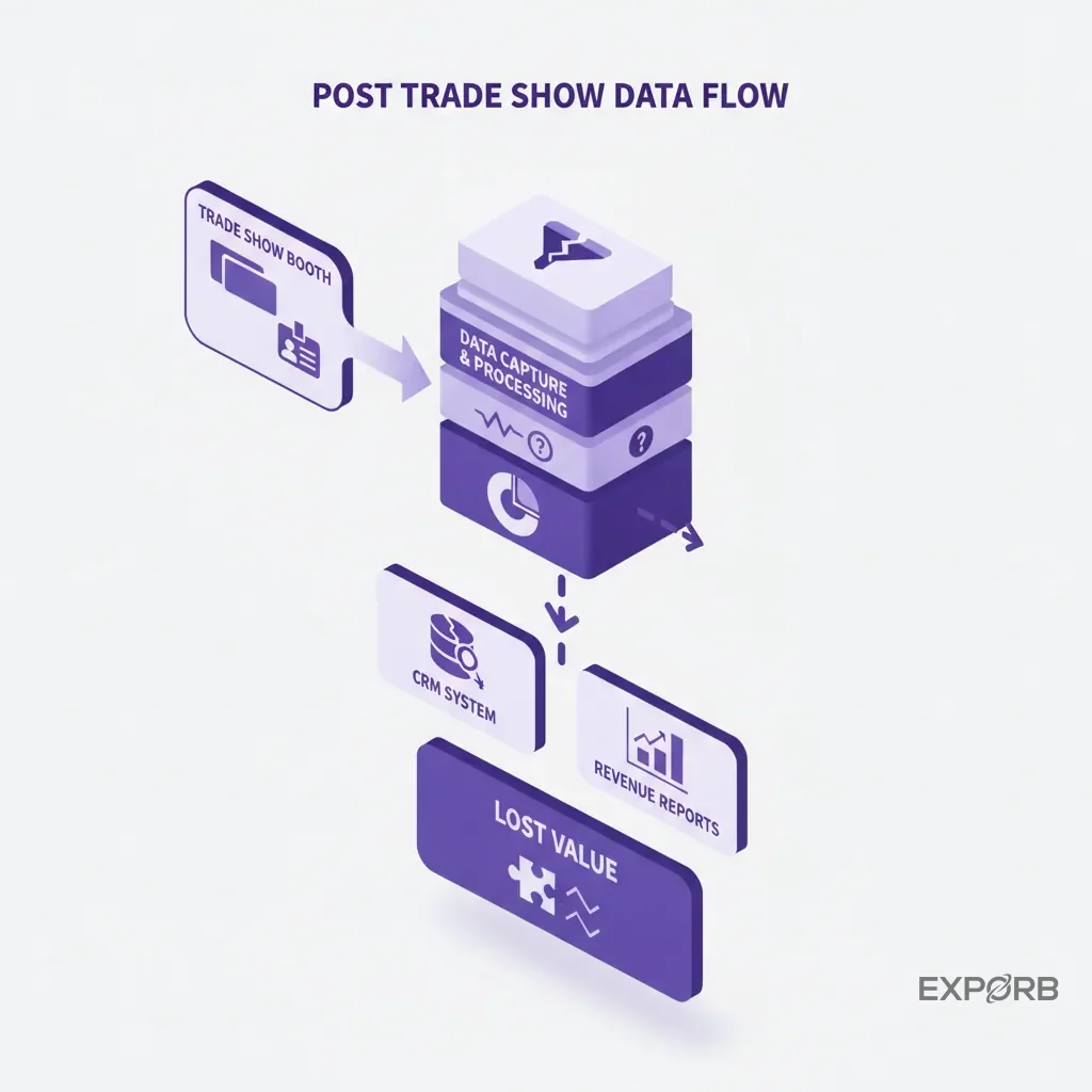
Event data rarely makes it into the CRM cleanly. Picture a sales rep after the show: they've got a spreadsheet of badge scans from the organizer, a stack of business cards with hurried notes, and maybe some fragmented observations typed into their phone. It takes a week of manual data entry to clean this mess up. By the time the sales team gets the leads, they're cold. That context is gone. The prospect's specific pain points, their buying timeline, the agreed-upon next steps—all vanish. The sales rep can't recall the critical details. It's a data graveyard. This is why you see fishbowls full of business cards that nobody will follow up on.
Challenging the misconception: A high lead count does not equal a successful show
Let's be blunt: celebrating a high lead count is the wrong approach. It incentivizes your team to scan everyone who walks by instead of having meaningful conversations. A show that generates 50 highly qualified, in-market leads who remember your name is infinitely more valuable than one that generates 500 unqualified contacts who don't. Your report needs to reflect this reality. It should tell a story about quality and pipeline, not just quantity.
What are the foundational elements of a modern report template?
A report that proves ROI is a strategic document, not merely a data dump. It connects event activities to business outcomes. It starts with your goals, accounts for the cost, and analyzes what actually happened on the floor. Without these core elements, you're just guessing.
Section 1: Event goals and strategic objectives (the 'why')
Before you list a single number, your report must clearly state the why. Why did you attend this show? You should've defined this before you ever booked the booth space.
- Primary Goal: Generate 30 Sales Qualified Leads (SQLs) for the new enterprise product.
- Secondary Goal: Increase brand awareness among Fortune 500 tech companies.
- Research Goal: Gather competitive intelligence on Competitor X's new feature set.
This section frames the entire report. Every metric that follows should directly relate back to whether you achieved these specific objectives.
Section 2: Budget vs. actual spend analysis
Money talks. This section straightforwardly accounts for what you planned to spend versus what you actually spent. Don't just show the total; break it down.
- Booth Space: Cost of the physical space.
- Booth Design & Build: Expenses for booth construction and aesthetics.
- Sponsorships & Marketing: Advertising and promotional costs.
- Travel & Accommodations: Team travel and lodging.
- Technology & Lead Capture Tools: Software and hardware for lead collection.
- Swag & Giveaways: Promotional items.
Transparency here builds trust with your finance team and leadership. If you went over budget, explain why and what the impact was. If you came in under, highlight the efficiency.
Section 3: Booth performance and team feedback
This is where you bring the qualitative data to life. How did the booth feel? What was the energy like? This isn't fluff—it's important context. Poll your team immediately after the show while their memories are fresh.
- What was the booth traffic like on Day 1 versus Day 3?
- Which talking points or demos resonated most with visitors?
- What were the most common objections or questions?
- Did the booth layout work? Were there bottlenecks?
This feedback is gold. It helps you iterate and improve your strategy for the next event, transforming anecdotal evidence into actionable insights.
How do you measure what truly matters: leads, pipeline, and ROI?
This is the heart of your report. You've set the stage with goals and budgets; now you prove the value with hard numbers. It's time to move from "leads" to "pipeline" and connect the dots directly to revenue. If you can't show how the $100K you spent will turn into $500K of pipeline, you've already lost.
Defining your lead quality tiers (MQL, SQL, SAL)
Stop treating all leads as equal. They aren't. Your first step is to categorize every single contact from the show based on quality and intent. Work with your sales team to define these tiers before the event.
- Hot Lead (SQL - Sales Qualified Lead): Has budget, authority, a defined need, and a clear buying timeline. Requested a follow-up demo or pricing call. These are your top priority.
- Warm Lead (SAL - Sales Accepted Lead): Expressed interest and fits your ideal customer profile (ICP), but the buying timeline is unclear. Needs nurturing.
- Cold Lead (MQL - Marketing Qualified Lead): Scanned their badge for a t-shirt; they fit your industry but showed no specific buying intent. Add them to your newsletter for long-term nurturing.
Your report should clearly show the breakdown: 25 SQLs, 100 SALs, and 375 MQLs. Now that's a much more interesting story than "500 leads."
Tracking key performance indicators from capture to close
The lead is just the beginning. A modern report tracks the entire lifecycle of an event lead. This is where most reports fall apart because the data is disconnected. You need to show the flow:
- Total Contacts Captured: The raw number.
- Leads by Quality Tier: The SQL/SAL/MQL breakdown.
- Meetings Booked: How many SQLs converted to a post-show meeting?
- Opportunities Created: How many of those meetings turned into a real sales opportunity in your CRM?
- Pipeline Generated: What's the total dollar value of those opportunities?
- Deals Closed-Won: The ultimate metric. How much revenue did this event directly produce?
Effectively tracking this requires discipline and tight integration between your capture method and your CRM.
Calculating cost per lead vs. cost per opportunity
Now you can calculate metrics your CFO actually cares about.
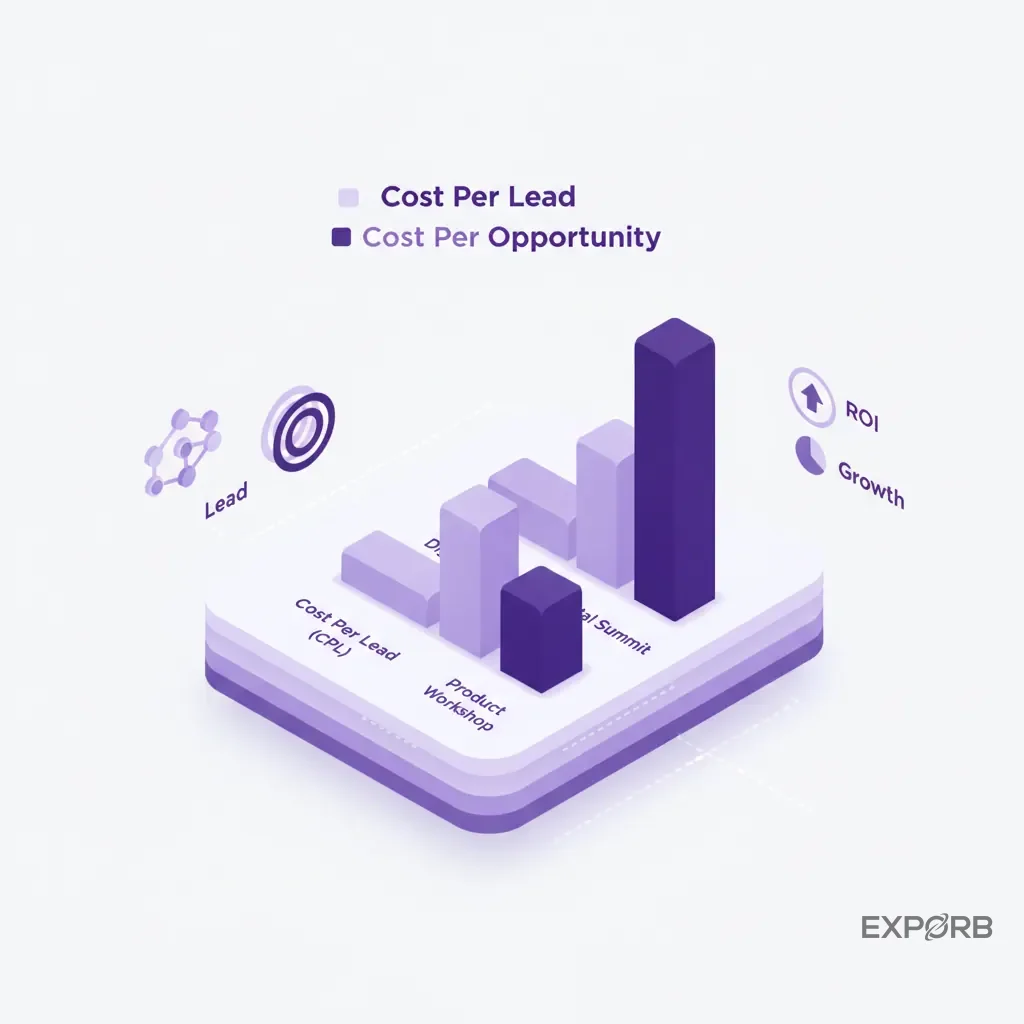
- Cost Per Lead (CPL): Total Event Cost / Total Leads. (e.g., $100,000 / 500 = $200 per lead). This is interesting, but not the whole story.
- Cost Per Opportunity (CPO): Total Event Cost / Opportunities Created. (e.g., $100,000 / 20 = $5,000 per opportunity). This is the number that justifies your budget. If your average deal size is $50,000, spending $5,000 to get there's a fantastic investment.
Key Financial Metrics for Your Post-Show Report
Beyond the booth: Integrating marketing and digital engagement
The trade show doesn't happen in a vacuum. It's a focal point of a larger campaign. Your report needs to show how your pre-show marketing and post-show digital buzz contributed to the results. It's about measuring the entire platform, not just the three days you spent on the floor.
Analyzing pre-show marketing campaign attribution
How did people learn you'd be at the show? You need to connect the dots.
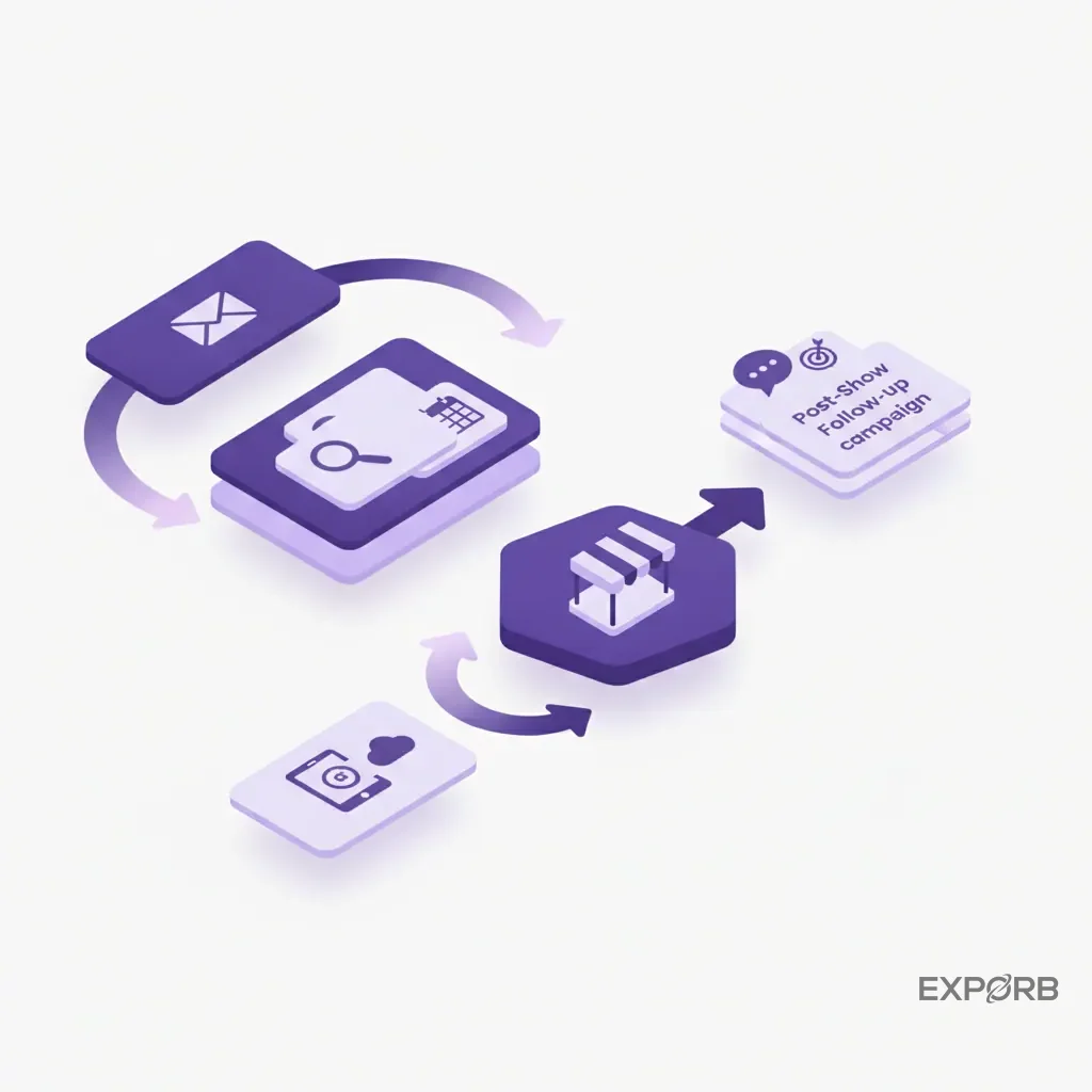
- Email Campaigns: Did you run a pre-show email campaign inviting your database to the booth? Track the open rates, click-through rates, and—most importantly—how many people who clicked the "Book a Meeting" link actually showed up.
- Social Media: Did you use a specific hashtag or run targeted ads? Report on the engagement, reach, and any leads that mentioned seeing your posts.
- Partner Promotions: Did any partners promote your presence? Account for their impact.
- Sales Outreach: Did your sales team do pre-show outreach to their top accounts? Track how many of those accounts scheduled and attended a meeting.
Attribution can be messy, but even directional data shows that you're thinking strategically about driving traffic. You're not just waiting for it.
Measuring digital engagement: Virtual booth visits and content downloads
Many large trade shows now have a hybrid component. Don't ignore the digital footprint. Your report should include metrics from the event's online platform.
- Number of virtual booth visitors.
- Downloads of your whitepapers or case studies from the event portal.
- Views of your company video or demo.
- Chat messages or questions received through the digital platform.
These all demonstrate interest and you should treat them as potential leads for follow-up.
Tracking post-show social media mentions and press coverage
The conversation continues once the show floor closes. Monitor social media and news outlets for mentions of your company, products, or booth.
- Social Mentions: How many times did people tag your company on LinkedIn or X (formerly Twitter)? What was the sentiment?
- Press & Analyst Briefings: Did you meet with any media or industry analysts? Note any articles, quotes, or reports that result from those meetings. According to Exhibitor Online, tracking subsequent press mentions is a key component of a full post-show analysis.
This section demonstrates how the event's impact extends beyond generating leads to building brand and market presence.
What does a board-ready executive summary look like?
Your CEO and board members won't read a 20-page report. They need the highlights—the bottom line—in a format they can digest in five minutes. The executive summary is the most important page of your entire document. It should be a one-page dashboard that tells a compelling, data-backed story.
Structuring a one-page dashboard for stakeholders
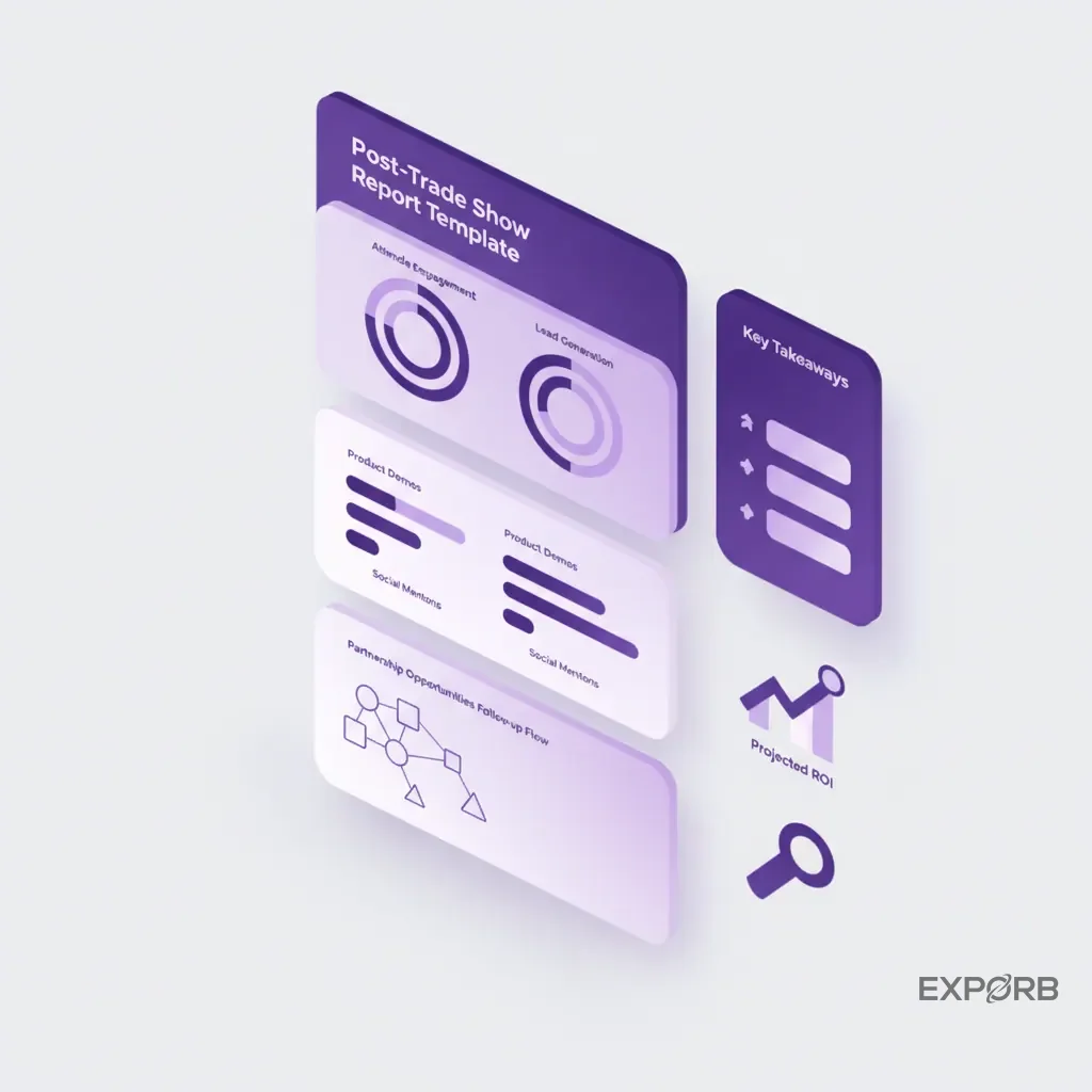
Keep it simple and visual. Use a mix of big numbers, simple charts, and bullet points. A typical structure features:
- Event & Goals: Name of the event, dates, and a one-sentence recap of your primary objective.
- Top-Line Results: Show the most impressive numbers right at the top. Think "Pipeline Generated," "SQLs Captured," and "Meetings Booked."
- Budget Summary: A simple "Budgeted vs. Actual" figure with a note on variance.
- Key Learnings: 2-3 bullet points on the most significant takeaways (e.g., "Demand for Feature Y was unexpectedly high," or "Competitor X is pivoting to a new market.").
- Recommendations: A single, clear recommendation for future action (e.g., "Recommend re-booking for 2027 with an expanded booth and a focus on live demos.").
Visualizing key results: Leads to forecasted pipeline
Don't just write the numbers—show them. A simple funnel graphic is incredibly effective. It visually walks the reader from the top of the funnel (Total Scans) down to the bottom (Pipeline Generated).
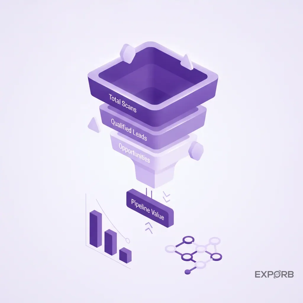
This instantly communicates the quality-over-quantity story. It shows you understand that not every scan turns into a deal; you focus on conversions that matter.
Presenting strategic recommendations for future events
The final part of the summary should look forward. Based on the data, what should the company do next? Your recommendations should be specific and tie directly to the results you've just presented.
- Go/No-Go: "Based on a $5,000 CPO and 50% ROI, we recommend renewing our contract for next year."
- Strategic Shift: "The high volume of questions about our integration capabilities suggests we should make that a central theme of our booth messaging next year."
- Budget Adjustment: "The success of our pre-show dinner with key accounts suggests we should double the budget for this activity and reduce spending on general sponsorships."
- New Initiatives: "We should explore a virtual component next year, given the strong digital engagement this year."
This transforms your report from a historical document into a strategic tool for future decision-making.
Related: The Ultimate Guide to Trade Show Lead Capture
The founder's blind spot: Solving the 'what did my team actually learn?' problem
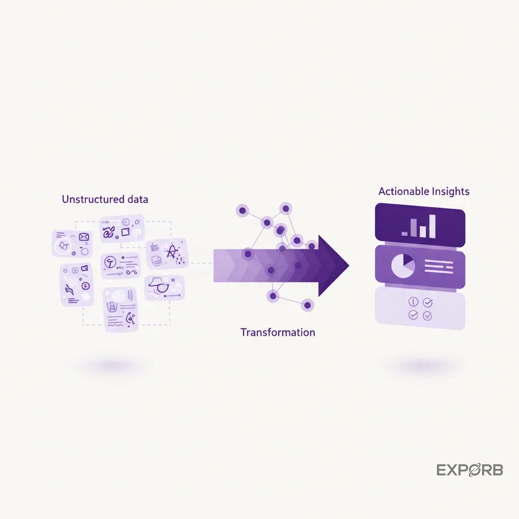
Here's the thing that keeps founders up at night after a big show. They know their team had hundreds of conversations, but they have no idea what was actually said. The real value of a trade show lies in the context of conversations, not just the contact information. And you almost always lose that context.
The pain point: Scattered notes, lost context, and missed opportunities
Your sales rep has a great conversation with a perfect-fit prospect. They jot down a few notes on the back of a business card: "VP at Acme Corp. Needs new logistics software. Follow up next week." They toss the card in a fishbowl with 499 others.
A week later, after the chaos of travel and catch-up, that note is meaningless. What specific logistics problems did they have? What was their timeline? Did they mention a competitor? The rep can't remember. The critical context vanishes. The follow-up email is generic, lacking any personalized hook. The opportunity withers. This scenario plays out hundreds of times at every single trade show.
Capturing the nuance of every conversation, not just contact data
Badge scanners are the worst offenders. They give you a name, title, and email. That's it. They don't capture intent, pain, urgency, or personality. You're spending thousands of dollars per lead to get information you could've found on LinkedIn for free.
The goal isn't just to collect contacts. It's to collect intelligence. You need a system that captures the nuance of the conversation itself. What were the exact words the prospect used to describe their problem? What was the tone of their voice when they talked about their current solution? That's the data that closes deals.
How AI-powered tools like Exporb provide total visibility into team learnings
This is precisely why we built Exporb. We built Exporb to solve the founder's blind spot. Instead of relying on messy notes, your team can capture the key parts of a conversation with voice notes. After the show, our AI transcribes and analyzes these conversations, pulling out key interests, pain points, and action items.
Suddenly, you're seeing a dashboard of insights, not just a spreadsheet of names. You can see which product has generated the most excitement, what competitors are being mentioned, and which of your reps are having the most valuable conversations. It turns the black box of booth conversations into structured, searchable data. You finally know what your team actually learned.
How can you operationalize your report with CRM and sales SLAs?
A report that sits in a folder isn't a waste of time. It's the final step to make it an active, operational tool that drives sales and improves future performance. This means integrating its findings directly into your CRM and establishing clear rules of engagement for your sales team.
Mapping template fields directly to your CRM schema
Your lead capture process should mirror your CRM structure. If your Salesforce instance has fields for "Primary Pain Point" and "Buying Timeline," your trade show capture tool needs those exact same fields.
This eliminates the manual data mapping nightmare after the show. When you export your leads, they should flow smoothly into your CRM without a data-entry clerk spending 40 hours cleaning up a CSV file. This means the rich data you collected on the floor—like lead quality tier and specific product interest—becomes immediately available to the sales team. A direct CRM export function is essential for any modern lead capture system.
Establishing and tracking speed-to-lead follow-up SLAs
Speed is everything. The odds of connecting with a lead decrease dramatically after the first hour. You must have a Service Level Agreement (SLA) with your sales team for event leads.
- Hot Leads (SQLs): Follow-up within 4 hours.
- Warm Leads (SALs): Follow-up within 24 hours.
- Cold Leads (MQLs): Enrolled in nurture sequence within 48 hours.
Your post-show report should include a section that tracks performance against this SLA. What was your team's average speed-to-lead? Which reps were fastest? This creates accountability and ensures your investment in generating leads isn't wasted by slow follow-up.
Automating the handoff from event capture to sales sequence
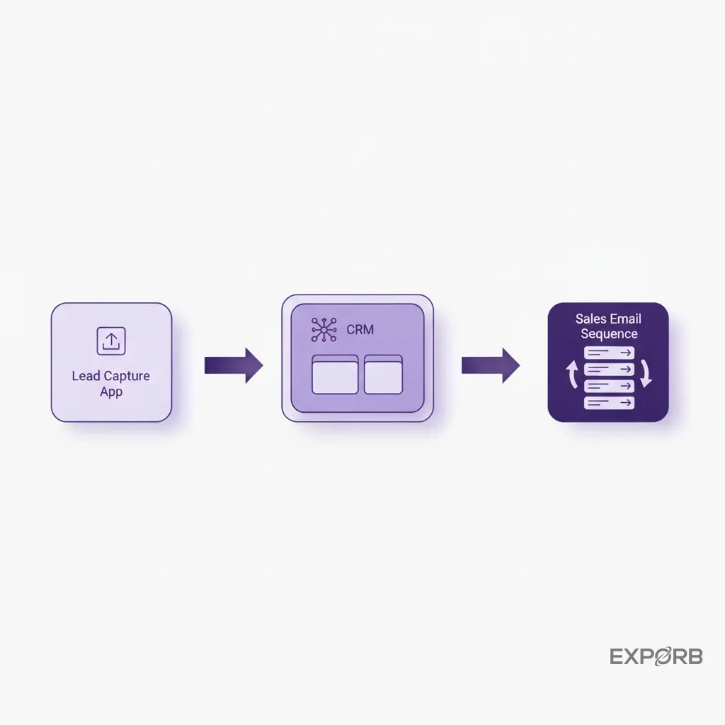
Why wait until after the show to follow up? The best time to send a personalized summary is right after the conversation ends. Modern tools can use the context from the conversation to draft a relevant follow-up email on the spot. The rep can review it, hit send, and the follow-up is done before the prospect even leaves the booth.
This alters the entire process. It automates the handoff. As soon as you capture and qualify a lead, you can automatically route it to the correct sales rep, add it to the right CRM campaign, and trigger the first touch of a follow-up sequence. It turns a week-long manual process into a real-time, automated workflow.
How do you analyze competitor and market intelligence from the show floor?
Trade shows are one of the best places to gather real-world intelligence on your competitors and your market. Everyone is in one place, showing off their latest products and messaging. Ignoring this opportunity is a huge mistake. Your report should have a dedicated section for these qualitative insights.
Systematically gathering data on competitor messaging and offerings
Don't leave this to chance. Assign team members to walk the floor and systematically document what your key competitors are doing.
- Messaging: What are the main slogans on their booth graphics? What pain points are they highlighting?
- Demos: What are they showing off in their live demos?
- Pricing/Packaging: Can you get a sense of their pricing or new product tiers? Sometimes they'll have flyers or one-pagers with this info.
- Booth Traffic: How busy is their booth compared to yours?
This structured approach, as recommended by industry guides like Zodiac Displays, transforms random observations into a useful competitive analysis.
Identifying emerging market trends and customer pain points
Listen carefully to the questions visitors are asking at your own booth. Are you hearing the same questions over and over? Is a new pain point emerging that you hadn't considered? For example, if a dozen different prospects ask if your software integrates with a specific new platform, that's a powerful market signal. It's a direct indication of where the market is heading. Document these emerging trends in your report.
Incorporating qualitative insights into your strategic planning
This intelligence shouldn't be an interesting footnote in your report; it must feed back into your product and marketing strategy.
- Did a competitor launch a feature that's getting a lot of buzz? Your product team needs to know immediately.
- Is the market shifting to a new vocabulary to describe their problems? Your marketing team needs to update your website copy.
This turns your trade show presence from a simple sales activity into a strategic market research initiative.
Building your template: A step-by-step guide with downloadable assets
Now let's put it all together. Building a great post trade show report template isn't complicated, but it requires discipline. It's about deciding what you'll measure before the show, and then building the structure to support that.
Step 1: Define your core KPIs and data sources
Before you create a single slide, list every metric you plan to track. For each KPI, identify the source of the data.
- KPI: Pipeline Generated → Source: Your CRM (e.g., Salesforce Opportunity Report)
- KPI: Cost Per Opportunity → Source: Finance Department + Your CRM
- KPI: Team Performance vs. SLA → Source: Your Lead Capture App's Analytics
- KPI: Brand Mentions → Source: Social Listening Tools
This means you have a plan to get the data you need. You won't be scrambling after the event.
Step 2: Structure the sections for narrative flow
Your report needs to tell a story. A logical flow makes it easy for executives to follow.
- Executive Summary: The one-page dashboard.
- Goals vs. Results: Restate the objectives and show how you performed against them.
- Lead & Pipeline Analysis: A deep dive into lead quality, conversions, and ROI.
- Budget Analysis: The breakdown of planned vs. actual spend.
- Qualitative Insights: Booth feedback, team performance, and competitive intelligence.
- Recommendations & Next Steps: Actionable takeaways for the future.
This structure moves from the high-level summary to the detailed analysis and ends with forward-looking strategy.
Step 3: Download our free 2026 post-show report template
To make it even easier, we've built a template that incorporates all of these best practices. It's a starting point you can customize for your own business and reporting needs. It has all the sections, charts, and tables laid out for you—just plug in your own data.
Getting your reporting right is the first step to maximizing your event program's value.
Related: [How to Calculate Trade Show ROI The Right Way](/blog/trade-show-roi-guide)
From retrospective report to predictive event strategy
A great post-show report doesn't just look back; it provides the data and insights you need to make smarter, more predictable decisions about your future event strategy. You stop treating events as one-off expenses and start managing them as a predictable pipeline-generating portfolio.
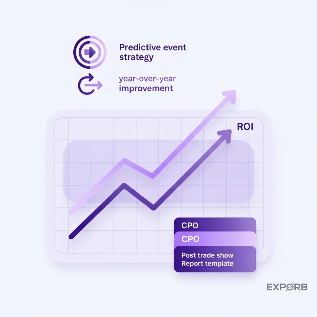
Using your report for year-over-year performance benchmarking
When you use a consistent template for every show, you create a powerful historical database. You can now compare performance year-over-year for the same event.
- Did our Cost Per Opportunity go down from 2025 to 2026?
- Did our SQL-to-Opportunity conversion rate improve?
- Is the total pipeline generated from this event growing or shrinking over time?
- How did our booth traffic compare to previous years?
You can't benchmark without standardized reporting. It helps you see long-term trends and understand the true value of your presence at key industry events.
Making data-driven decisions for your 2027 event portfolio
Now you can approach your event planning with data, rather than just gut feelings. When it's time to plan the 2027 budget, you can pull out your reports and make a compelling case.
Instead of saying "I think we should go to CES again," you can say, "CES 2026 generated $500K in pipeline at a CPO of $4,500, delivering a 75% ROI. We recommend increasing our investment by 20% to target the emerging robotics pavilion, which our competitive analysis identified as a key growth area."
See the difference? One is an opinion; the other is an investment thesis backed by data.
Creating a continuous feedback loop for event improvement
Finally, the report forms the cornerstone of a continuous improvement cycle. The recommendations from your 2026 report should become the goals for your 2027 event.
- 2026 Recommendation: "We need to improve our speed-to-lead."
- 2027 Goal: "Achieve a sub-4-hour follow-up SLA for all SQLs."
This creates a flywheel effect. Each event makes the next one smarter, more efficient, and more profitable. You stop making the same mistakes and start compounding your successes. Your trade show program transforms from an expensive line item into a fine-tuned, predictable revenue engine. A better report is where it all starts.